Sitesee
Travel planning mobile app based on friends’ recommendations and shared/tagged photos.
Teammates: Colin Tierney, Shavara Srabian
To keep the focus of the design on the needs of real users, we researched and identified the personas and archetypes.
We then created a set of features based on the wishes of the client and needs of the user, prioritizing them based on user value, business value, and technical complexity.
Taking all the features of the app we had documented, we wrote them on individual post-its to easily group like-items, tasks, and features. Once all cards had been sorted and grouped, we assigned overarching category labels to each group.
With an agreed taxonomy, we were able to create the sitemap or schematic that represents the navigation and structure of the app.
With the sitemap complete, we could now plan the path a user would take through the app. Thinking about the user journey helps us identify and rectify potential pain-points so we can enhance the overall user experience. Creating user flows can help shorten the overall user journey and can help identify alternative routes through the content.


Before jumping to the computer to begin wireframes, we started with the quick, cheap, and disposable form of sketching to easily discuss and revise.
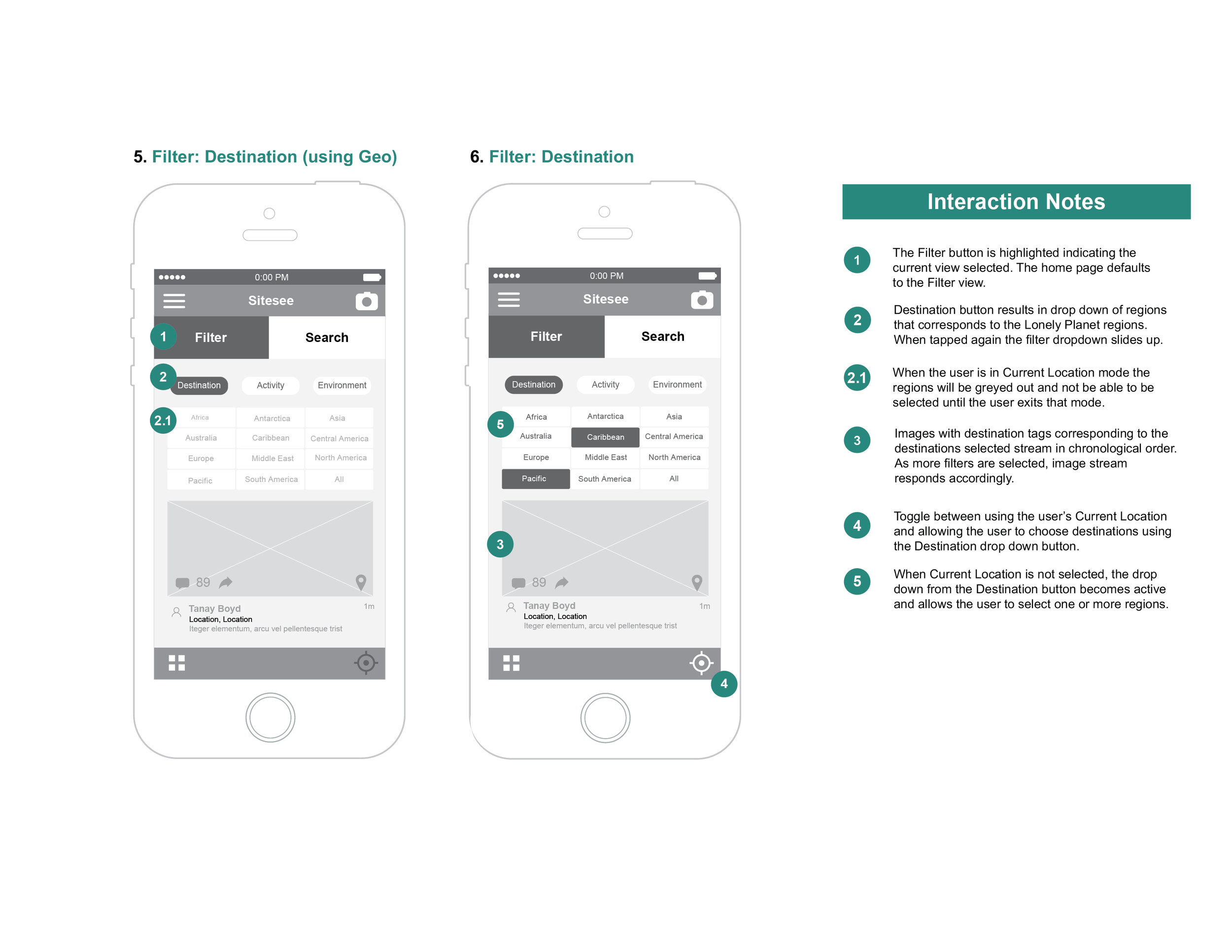
To articulate our design thinking in the same way we use sketches, we created greater detailed wireframes to illustrate the user interface and give an overall sense of how the parts of the app work together. We went further to annotate them, to verbally describe user interactions.


